A moving car animation is a fun and practical way to learn web animation basics. Using only HTML and CSS, you can produce a visually dynamic effect—perfect as an eye-catching portfolio feature or a learning project that demonstrates your knowledge of web development fundamentals.
Building this animation helps you master:
- CSS positioning and layering
- Keyframe animations
- Responsive layouts and creative use of background images
- Reusable HTML structures
🌟 What You’ll Create
By the end of this guide, you’ll have a seamless car animation:
- A car travels smoothly above a moving road and passing cityscape background.
- Realistic wheel rotation effect.
- All using pure HTML and CSS—no JavaScript needed.
🛠️ Tools and Files Needed
- HTML file (
index.html) - CSS file (
style.css) - Image assets:
Tip: Optimizing images for web use improves load times and user experience.
Filename: index.html
<!DOCTYPE html>
<html lang="en">
<head>
<title>
Moving Car Animation Effect
with HTML CSS JavaScript
</title>
<link rel="stylesheet" href="style.css">
</head>
<body>
<div class="main-container">
<div class="road"></div>
<div class="road-sideview"></div>
<div class="moving-car">
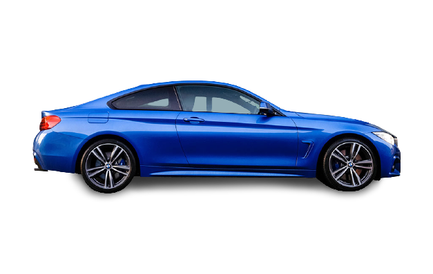
<img src="bmw.png"
alt="moving-car">
</div>
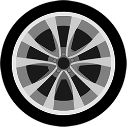
<div class="car-wheel">
<img src="wheel.png"
alt="moving car wheel"
class="car-back-wheel">
<img src="wheel.png"
alt="moving car wheel"
class="car-front-wheel">
</div>
</div>
</body>
</html>
Filename: style.css
* {
    margin: 0;
    padding: 0;
}

.main-container {
    height: 100vh;
    width: 100%;
    background-image: url('sky.jpg');
    background-size: cover;
    background-position: center;
    position: relative;
    overflow-x: hidden;
}

.road {
    height: 220px;
    width: 500%;
    display: block;
    background-image: url('road.png');
    position: absolute;
    bottom: 0;
    left: 0;
    right: 0;
    z-index: 1;
    background-repeat: repeat-x;
    animation: road 5s linear infinite;
}

@keyframes road {
    100% {
        transform: translateX(-1400px)
    }
}

.road-sideview {
    height: 130px;
    width: 500%;
    display: block;
    background-image: url('city.png');
    position: absolute;
    bottom: 200px;
    left: 0;
    right: 0;
    z-index: 1;
    background-repeat: repeat-x;
    animation: road-sideview 5s linear infinite;
}

@keyframes road-sideview {
    100% {
        transform: translateX(-1400px);
    }
}

.moving-car {
    width: 500px;
    left: 50%;
    bottom: 30px;
    transform: translateX(-50%);
    position: absolute;
    z-index: 2;
}

.moving-car img {
    width: 90%;
    animation: moving-car 1s linear infinite;
}

@keyframes moving-car {
    100% {
        transform: translateY(-1px);
    }

    50% {
        transform: translateY(1px);
    }

    0% {
        transform: translateY(-1px);
    }
}

.car-wheel {
    left: 50%;
    bottom: 178px;
    transform: translateX(-50%);
    position: absolute;
    z-index: 2;
}

.car-wheel img {
    width: 65px;
    height: 65px;
    animation: car-wheel .5s linear infinite;
}

@keyframes car-wheel {
    100% {
        transform: rotate(360deg);
    }
}

.car-back-wheel {
    left: -170px;
    position: absolute;
}

.car-front-wheel {
    left: 80px;
    position: absolute;
}
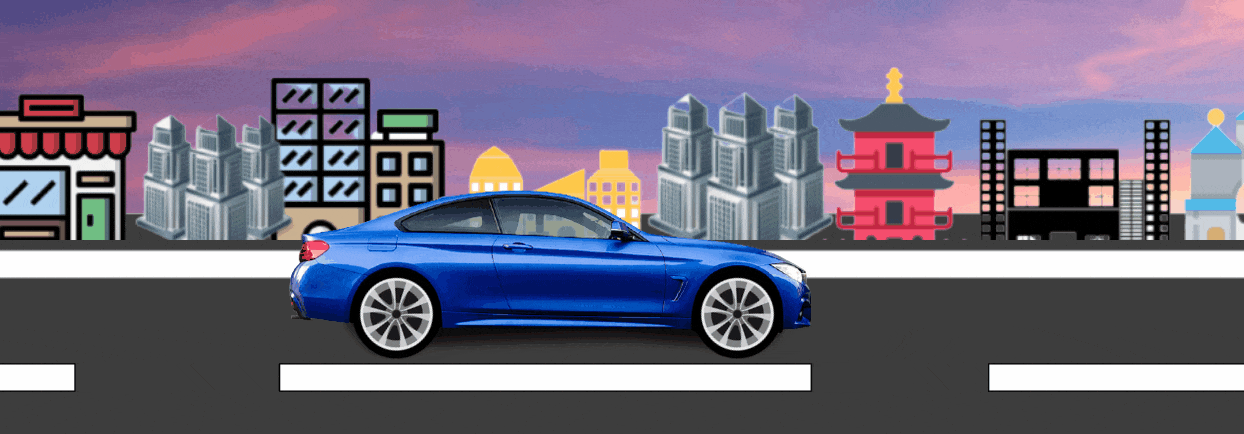
After combining the above HTML and CSS code, we will get the moving car animation effect.
🚀 Key Steps Explained
- Background & Scene Setup
- Use the
.main-containerdiv as the canvas. - Layer three backgrounds: sky, animated road, and cityscape using CSS positioning and z-index.
- Use the
- Car & Wheels
- Car image positioned absolutely to stay center.
- Two wheels absolutely placed under the car and animated for rotation.
- Animations
- Road and buildings use horizontal keyframe animations to create motion.
- Wheels use
rotate(360deg)for a spinning effect. - Car uses a subtle
translateY()for bouncing movement.
📝 Customization Tips
- Swap images for different car or city styles.
- Adjust keyframe timing for faster/slower animation.
- Make the scene responsive with media queries for mobile devices.
Learning how to design a moving car animation with HTML and CSS is a fantastic way to improve your frontend skills, create fun web effects, and stand out in job or client projects. Experiment with backgrounds, colors, and car models to make the animation uniquely yours.